Building a robust color library is a foundational step for anyone working in textile design. Whether you’re developing prints for fashion, interiors, or custom fabric projects, having a well-organized palette ensures consistency, speeds up your workflow, and helps you communicate effectively with clients and production partners. This guide covers the essential steps and considerations for assembling a color reference system tailored to the needs of textile professionals.
Understanding the nuances of color in textiles is crucial, especially when aiming for accurate reproduction across different materials and printing methods. If you’re also interested in how surface feel impacts print outcomes, you might find what is soft hand feel in garment printing useful as a complementary resource.
Why a Dedicated Color Reference Matters in Textile Work
In textile design, color is more than just a visual element—it’s a language. A dedicated color library allows designers to:
- Maintain consistency across different projects, seasons, and product lines.
- Communicate precise color choices with manufacturers, printers, and clients.
- Streamline the design process by providing ready-to-use palettes for quick iteration.
- Reduce costly errors caused by miscommunication or color mismatches in production.
The process of how to create a color library for textile design involves both creative and technical considerations, ensuring that your palette is both inspiring and practical for real-world application.
Key Steps to Building a Textile Color Collection
1. Research and Inspiration Gathering
Start by collecting inspiration from a variety of sources. Look at trend forecasts, nature, art, and historical textiles. Save swatches, photographs, and digital images that resonate with your brand or project vision. This initial research phase helps you identify recurring hues and emerging trends relevant to your target market.
2. Selecting a Color System
Choose a standardized color system as the backbone of your library. Popular options include Pantone, RAL, and NCS. For textile-specific needs, Pantone’s Fashion, Home + Interiors (FHI) system is widely used. Using a recognized system ensures that your colors can be communicated and reproduced accurately across different suppliers and production facilities.
3. Creating Physical and Digital Swatches
Physical swatches are essential for evaluating how colors appear on actual fabrics. Print or dye small samples on your most commonly used materials, noting how fiber content and weave affect the final appearance. Alongside physical samples, maintain a digital library with color codes (RGB, HEX, CMYK, and Pantone references) for use in design software.

4. Organizing Your Palette for Textile Design
Group your colors into logical categories. You might organize by season (spring/summer, autumn/winter), mood (vibrant, muted, neutral), or application (base colors, accents, prints). Label each swatch with its code, name, and any relevant notes about fabric compatibility or print technique.
For digital organization, tools like Adobe Illustrator, Photoshop, or dedicated palette managers can help you store and retrieve color data efficiently. Many designers also use spreadsheets or cloud-based systems for easy sharing with collaborators.
Ensuring Color Accuracy Across Textile Processes
Managing Color Consistency in Fabric Printing
One of the biggest challenges in textile work is ensuring that your chosen colors look the same from screen to fabric. Factors like fiber type, dye method, and print technology can all impact the final result. To minimize discrepancies:
- Always test colors on the actual fabric and with the intended printing method.
- Keep detailed records of dye recipes, printer settings, and environmental conditions.
- Work closely with your production partners and share physical swatches for reference.
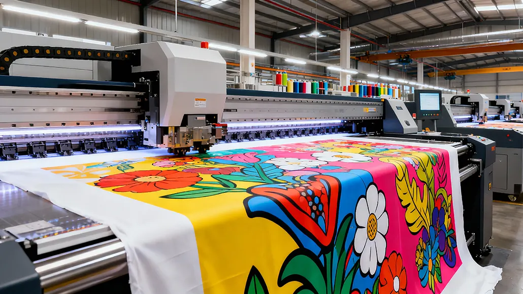
For a deeper dive into the technical aspects of digital fabric printing, check out this comprehensive guide to digital fabric printing.

Adapting Your Color Library for Different Applications
As you expand your work into new areas—such as home textiles, sportswear, or accessories—update your palette to reflect the unique requirements of each category. Some colors may perform better on certain fibers or under specific lighting conditions. Regularly review and refine your library to keep it relevant and effective.
Best Practices for Maintaining and Updating Your Color Reference
A color library is a living resource. To keep it useful:
- Review your palette seasonally to incorporate new trends and retire outdated shades.
- Document every change with dates, reasons, and test results.
- Solicit feedback from clients, colleagues, and production teams to identify gaps or issues.
- Back up your digital files and store physical swatches in a protected environment to prevent fading or damage.
Integrating Color Libraries with Textile Design Workflows
Incorporate your palette into every stage of the design process—from initial sketches to final production files. Use color references in mood boards, technical packs, and client presentations. This not only ensures consistency but also speeds up approvals and reduces the risk of costly mistakes.
For those interested in optimizing their production setup, exploring the benefits of micro-factory models for fashion printing can further enhance efficiency and color control.
Common Challenges and Solutions in Textile Color Management
Dealing with Color Shifts and Variations
Even with careful planning, color shifts can occur due to differences in dye lots, fabric batches, or environmental factors. To address this:
- Request lab dips or strike-offs before full production runs.
- Establish clear color tolerances in your technical specifications.
- Maintain open communication with suppliers regarding expectations and acceptable variances.
Balancing Creativity and Reproducibility
While it’s tempting to experiment with unique hues, always test new colors for reproducibility. Some pigments may not translate well across different substrates or may be difficult to match in bulk production. Prioritize colors that are both distinctive and practical for your manufacturing partners.
FAQ
What tools are best for managing a textile color library?
Many professionals use a combination of physical swatch books (such as Pantone FHI), digital palette managers, and spreadsheets. Design software like Adobe Illustrator and Photoshop also allow you to save and organize color swatches for easy access.
How often should I update my color reference?
It’s best to review and update your palette at least once per season or whenever you launch a new collection. This keeps your library aligned with current trends and ensures that all colors remain available and reproducible.
Can I use my color library for both digital and screen printing?
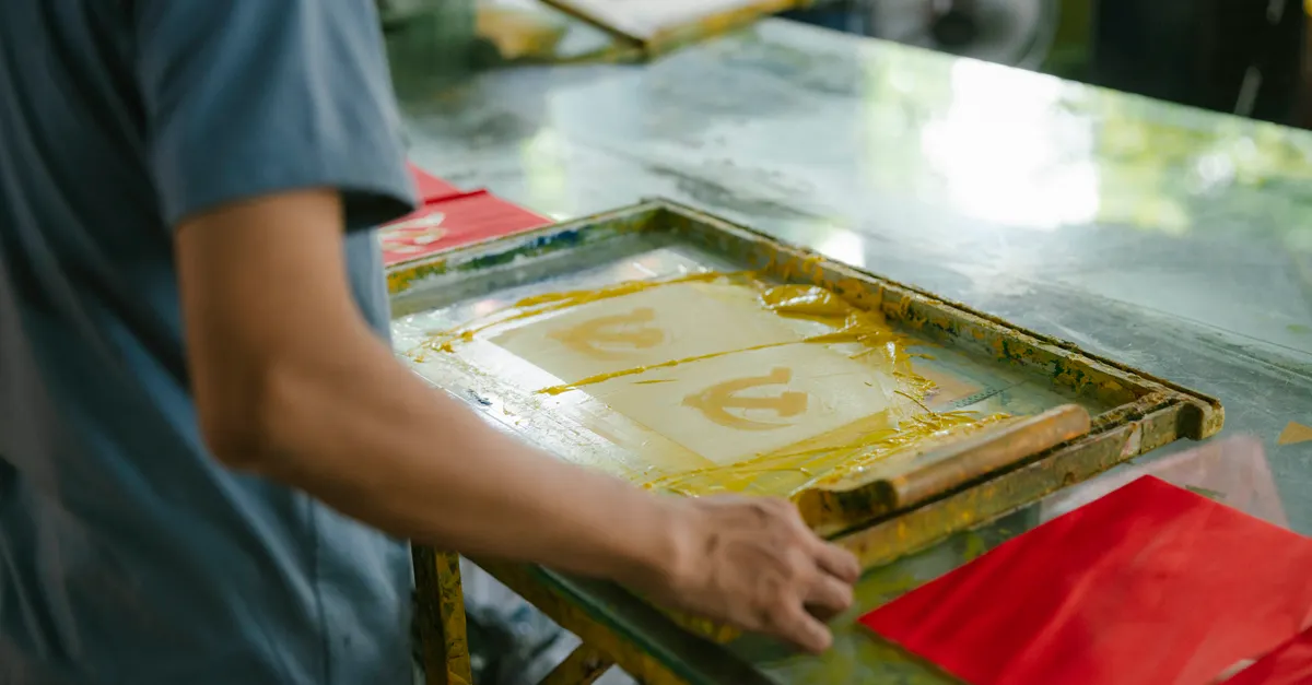
Yes, but always test your chosen colors with each printing method. Digital and screen printing can yield different results due to ink types, fabric absorption, and print resolution. Adjust your palette as needed to achieve consistent results across all techniques.